In this digital age, a company’s website is one of their most valuable assets. Brands constantly design, redesign, optimize, and test their B2B websites on the never-ending journey to perfection.
Take a look at the following statistics from Parqa, a digital marketing agency, and you’ll understand why B2B companies heavily prioritize website design:
38% of people will stop engaging with a website if the content or layout is unattractive.
46% of customers base their decisions on the credibility of a website from its visual appeal and aesthetics.
First impressions of a site’s credibility are 94% design-related.
Unfortunately, designing a B2B website is no easy task. The challenge stems from a number of factors. A B2B website must be clear, concise, visually appealing, optimized for SEO, and easy to navigate. And of course, it must offer the right details about your brand and products.
If you’re working on a rebrand, those essential qualities are a lot to take in. But don’t fear — today’s blog post is here to help. We’ve put together a list of some of our favorite B2B websites, and they’re sure to provide a jolt of inspiration for your next rebrand. Let’s get into it!
1. Asana
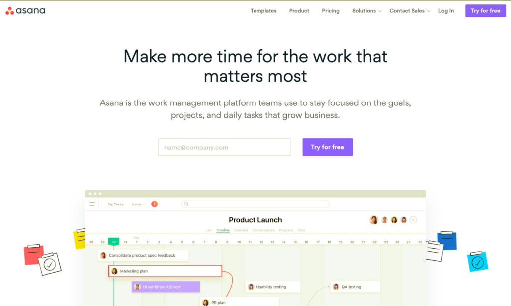
Asana’s homepage features two strong design elements — a well-placed call-to-action and simple animations. The CTA is placed above the fold (meaning, the first portion of a web page that is visible without scrolling). And, the CTA is unmissable due to the surrounding white space. A simple, one-field form accompanies the CTA. So, all new visitors have to do is enter their email address and get started right away.
Beneath the fold, users encounter the first of several animations that live on Asana’s homepage.
We’ll discuss more animations later on, so we’ll offer this disclaimer now. There are a right way and a very wrong way to use animations on a B2B site:
When used correctly, animation can be a valuable tool for B2B brand storytelling and showcase products that can’t be adequately expressed in a still photo. It grabs the viewer’s attention but doesn’t distract from the rest of the content on the page.
When used incorrectly, an animation is an attractive distraction at best and a confusing eyesore at worst. Designers often make the mistake of creating animations simply because they can, or because they believe animations are emblematic of a greater sense of innovation and professionalism. But if an animation serves no real purpose, it will distract viewers rather than inform them.
Asana’s website provides an example of the right way to use animations. For one, it shows exactly what the Asana platform looks like in action. And, it makes sense for this content to be animated. As a project management tool, Asana is all about motion and progress — users move tasks from one stage to another, rearrange calendars, assign tasks to specific employees, etc.
These are simple features — but they rely on motion, so an animation is more fitting than a series of screenshots.
2. Hubspot
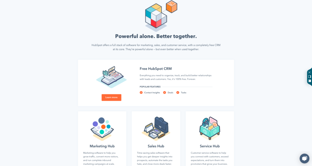
Hubspot offers a number of solutions for marketing, sales, and customer service professionals. It’d be impossible to represent the full scope of their offerings on a single page — and Hubspot’s website wisely doesn’t attempt to do so.
For example, take a look at the above screenshot. There’s not a lot of content there, certainly not enough to comprehensively explain what each of Hubspot’s tools and solutions can do. But, the minimal copy and uncluttered layout call attention to the subpages Hubspot wants its visitors to click on next — the free CRM, the Marketing Hub, the Sales Hub, and the Service Hub.
Each of those subpages features much more copy than the homepage does, but they include enough multimedia elements that they remain engaging to scroll through.
3. Salesforce
If you work in the B2B space, you’re familiar with Salesforce. The software company offers the most popular CRM platform in the world, along with a wide variety of supporting tools and integrations.
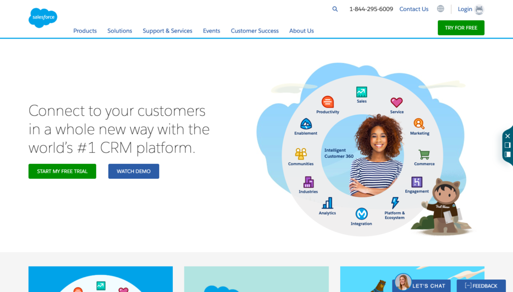
The Salesforce website presents a perfect blend of personal and creative design elements. Their site features images of real human beings along with the “Trailhead” cartoon characters Salesforce created to “embrace the fun side” of their company. This dichotomy between realistic and imaginary designs contributes to a website that is equal parts engaging and informative, lighthearted and personal, simple and unique.
4. Yapstone
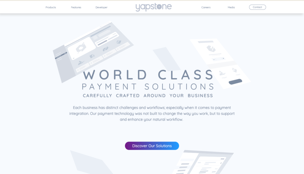
Yapstone might take the cake as the most innovative website on this list. As you scroll their homepage, the first word that comes to mind is “futuristic” — from the unique fonts to the sleek background images that float across the page as if they’re unburdened by gravity. One might not expect this stylish flair from a company that offers online and mobile payment solutions — but the unexpected artistry of the website is a welcome surprise.
Keep in mind — Yapstone’s approach would be a disaster in the wrong hands. Plenty of other brands aim for the “futuristic” aesthetic and go way overboard, cramming as many abstract designs and gimmicks into their website as possible. There’s a fine line between impressing a prospect with your innovative website and giving them a headache.
Yapstone’s site design works so well because its designers showed restraint. Each page has a clean, minimalist layout that prevents the futuristic aesthetic from overwhelming users.
5. PublishThis
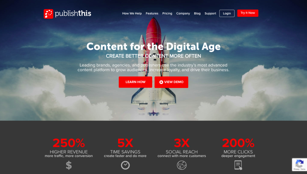
PublishThis is a content marketing platform that helps companies create, publish, and scale their B2B content. Unlike our last example, the PublishThis website is entirely devoid of bells and whistles. And yet, it’s proof that simplicity can be just as effective as innovative as flashy designs.
The first thing you notice on the PublishThis site is the image of a rocket ship — wisely placed behind the bold header copy in order to drive home the metaphor. The rest of the site is very straightforward from a design perspective. But, the well-organized layout makes the site engaging, without ever seeming bland or one-note.
Remember: the design of your site shouldn’t be the center of attention, but rather the framework that supports the information you want your site to express.
6. Grammarly
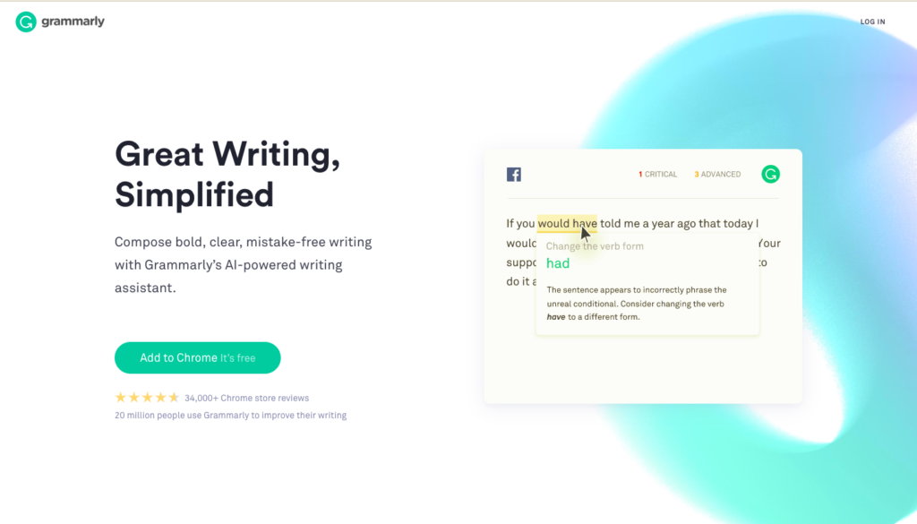
Grammarly is another great example of functional minimalism in B2B site designs. If you’re unfamiliar, Grammarly is a leading grammar checker and writing assistance platform that’s popular among B2B content marketing professionals.
Unlike many of the brands we discussed above, Grammarly isn’t a complex solution that requires a highly expository website. As such, the site’s simple design nicely complements the product. It wisely calls attention to the apps and platforms Grammarly integrates with, as this detail is a deal-breaker for potential customers.
Despite the minimalist approach, Grammarly’s website still manages to make perfect use of two animations. These animations show what the tool looks like in action, and allow users to visualize their own work being edited and improved by Grammarly’s AI-powered technology.
7. Trello
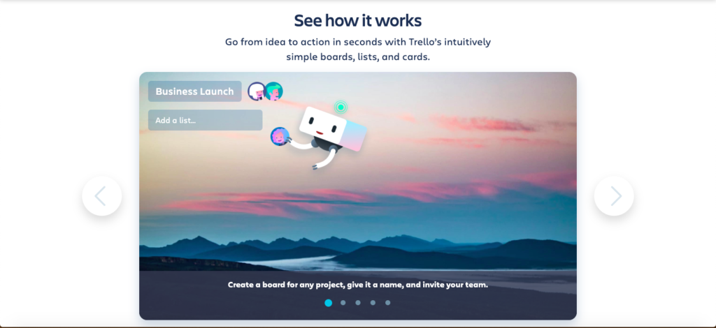
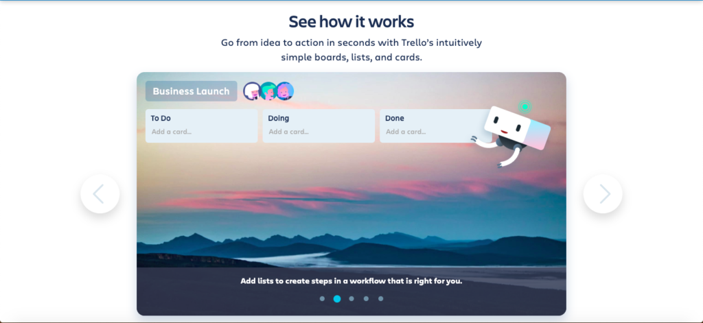
Trello is a project collaboration tool that bears several similarities to Asana, whose website we discussed earlier in this post. Whereas Asana’s site included realistic animations, Trello’s site uses interactive slideshows to showcase the platform in action.
We like this approach because it requires site visitors to participate and click through the slideshow to see how the platform works. This interaction is satisfying without being distracting or dominating too much space on the site.
The key takeaway from Trello’s website is this: If you include interactive content in your site design, keep it simple. Give users the rewarding feeling of participating in the site experience, but don’t let your interactive design turn into a video game they’ll never move on from.
8. Dropbox for Business
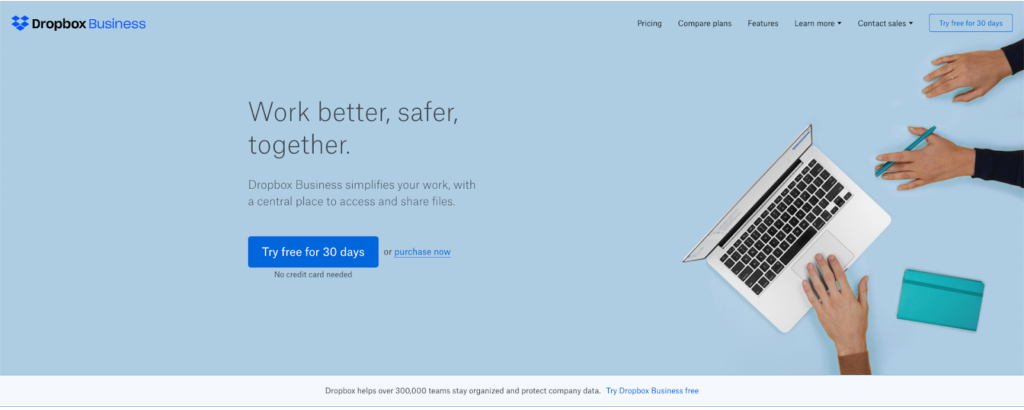
The Dropbox for Business site features a few unique design elements. Most notably, Dropbox’s pricing options are front and center on the homepage, just below the fold. On the surface, this seems like a strange format: why devote so much space to your pricing packages before even explaining what the platform does?
But, this site design shows how well the company knows its audience. Business leaders don’t visit this site to learn what Dropbox is; anyone who doesn’t live under a rock is already somewhat familiar with the popular file-hosting service. They visit the site to learn what plans Dropbox offers for businesses, and learn about each plan’s advantages and disadvantages. This simple site design provides all that information upfront, with no clutter or unnecessary bells and whistles.
We also like Dropbox’s inclusion of an FAQ section, where customers can click on one of four common questions to generate an answer in a dropdown box. Again, most websites don’t include an FAQ section that fills the entire screen — but it’s effective here because it’s exactly the type of thing Dropbox’s users would look for when they visit the Dropbox for Business site.
9. ACME
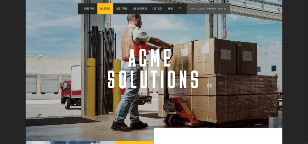
Acme is a packaging provider that sells to shippers, retailers, and logistics operators across multiple industries. You might read that description and expect their website to be a bit mechanical and by-the-book — but it’s actually the most beautiful and polished website on this list.
The crisp, high-resolution photographs are what make the Acme site so appealing. These photographs dominate the majority of the homepage and each individual subpage, and they’re complemented by an elegant yellow, black, and white color scheme. The grid layout on Acme’s Solutions page allows users to quickly find a specific industry or use case.
The stunning photography demands attention, but Acme’s clean, well-organized layout proves the website is much more than a source of pretty pictures.
10. Mailchimp
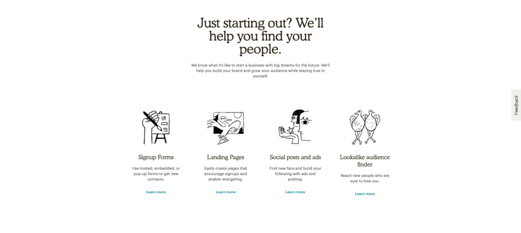
Mailchimp’s site features a number of interesting design elements, including subtle animations and an emphasis on customer photographs. But what stands out most is Mailchimp’s unique icons, a few of which you can see in the screenshot above.
If you take away one thing from Mailchimp’s icons, let it be this — find small ways to stand out. A creative icon design won’t make or break your website but will help set your brand apart from others in your field.
Read More: Best Free Mailchimp Templates for Email Marketing
Final Thoughts on B2B Website Designs
Across these ten examples of B2B websites, we’ve explored a wide variety of interesting design elements. We’ve discussed color palettes, animations, videos, photography, CTAs, and more— and we hope you found some new ideas to inspire your next website rebrand.
Of course, a site design that works for one company might not work for yours. Make sure you build a website that aligns with your brand, products, business goals, and most importantly, your audience and their specific needs. Determine what your prospects and customers want from your company, and you’ll be able to build a website they visit and revisit time and time again.
For more help building your B2B brand, contact ZoomInfo today. We’re a leading B2B contact database and we have the tools you need to scale your marketing efforts and grow your business.


